Table of Contents
General Dashboard Overview #
The Retainly Dashboard provides a centralized place to monitor the various metrics and activities that are crucial for your customer communication efforts.
How to Access the Dashboard: #
1. On the sidebar, click on the “Dashboard” option.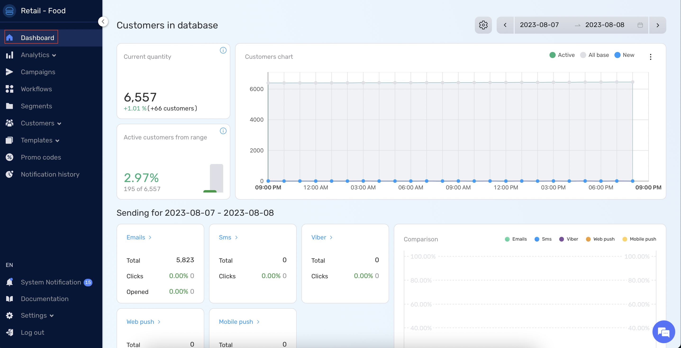
What you will see: #
- Analytics Overview: At a glance, view metrics associated with customers, segments, funnels, and sendings.
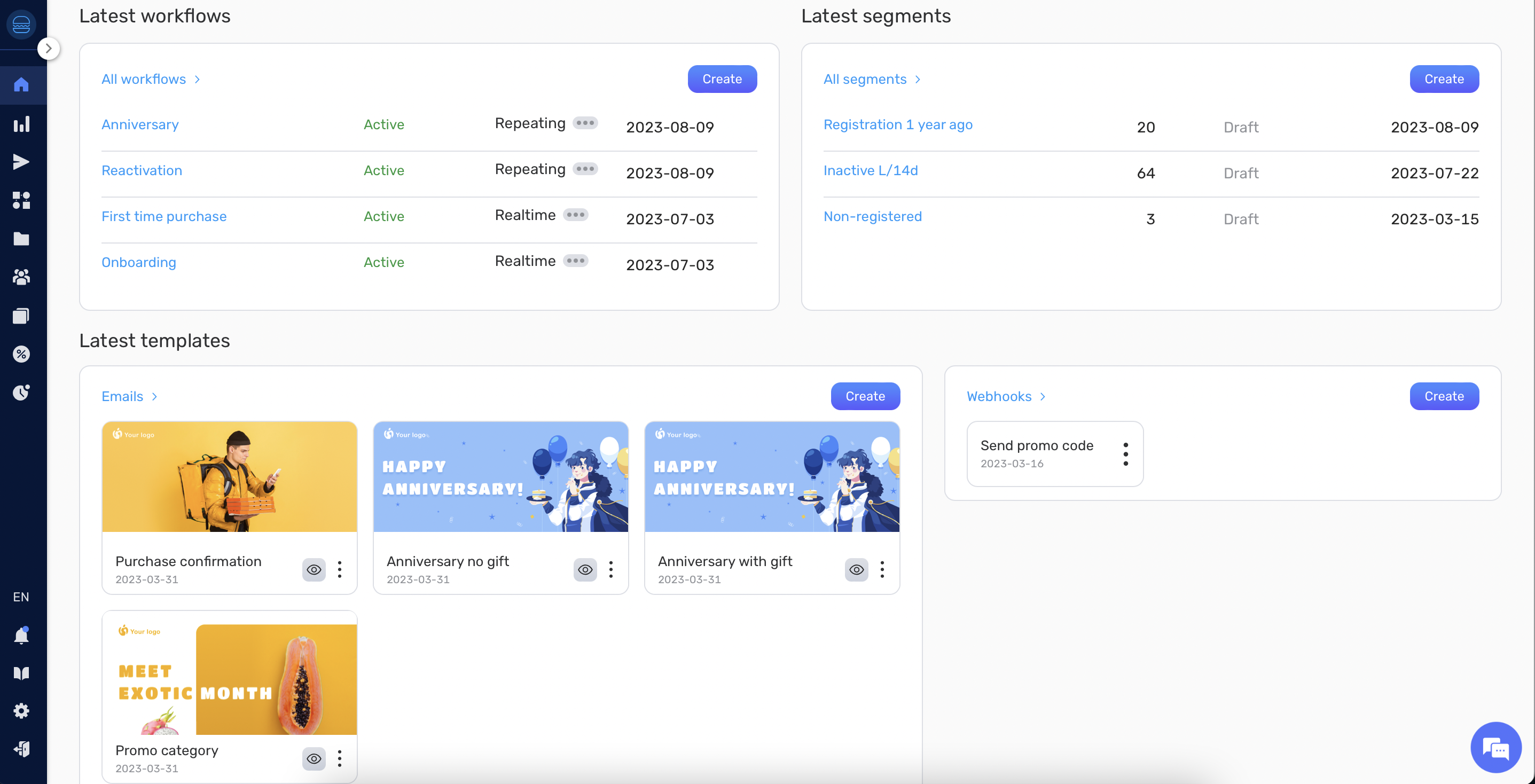
- Recent Actions: This section displays the latest actions you’ve performed in your workspace, such as recently created workflows, segments, and templates.
Database Analytics #
The Database Analytics provide essential insights into your customer database.
Displaying Database Analytics: #
- These analytics are displayed by default when you enter the Dashboard.
What you will see: #
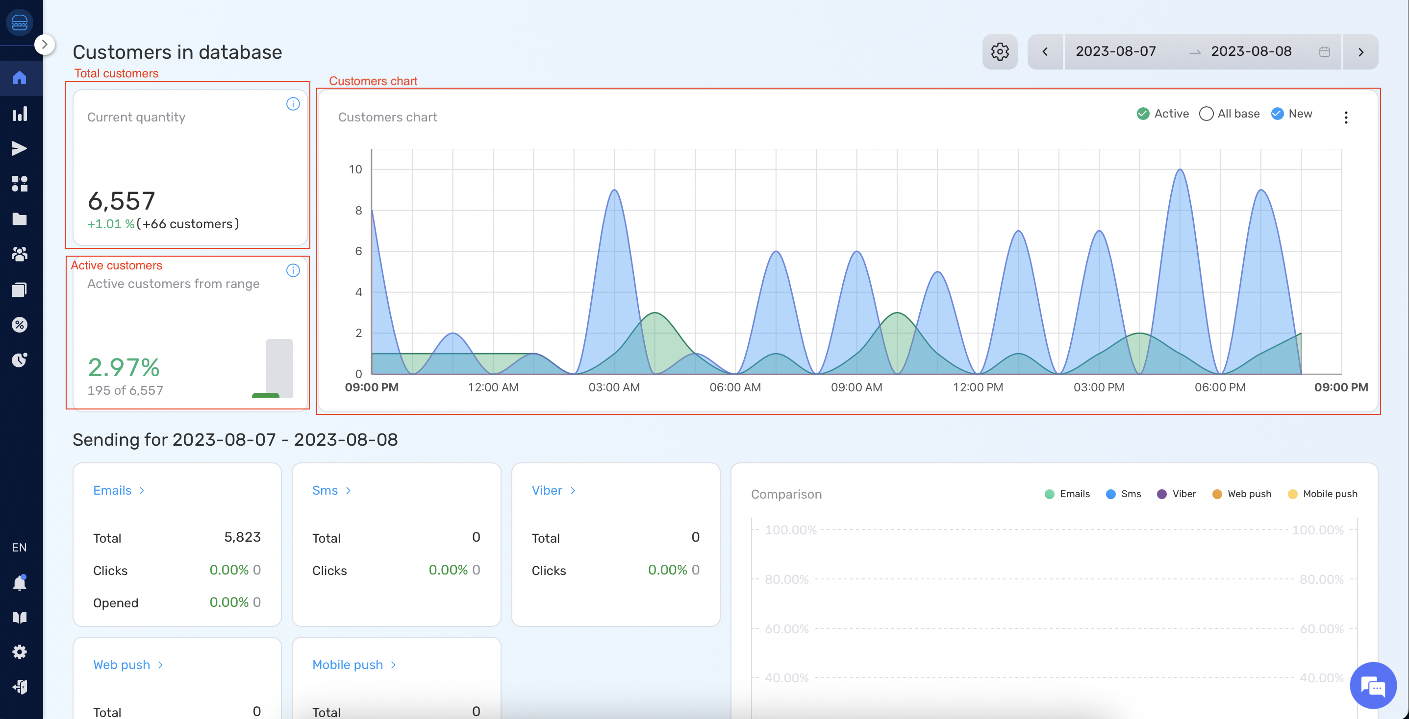
- Total Customers: The overall number of customers present in your database.
- Active Customers: The number of customers that have been communicated with through workflows.
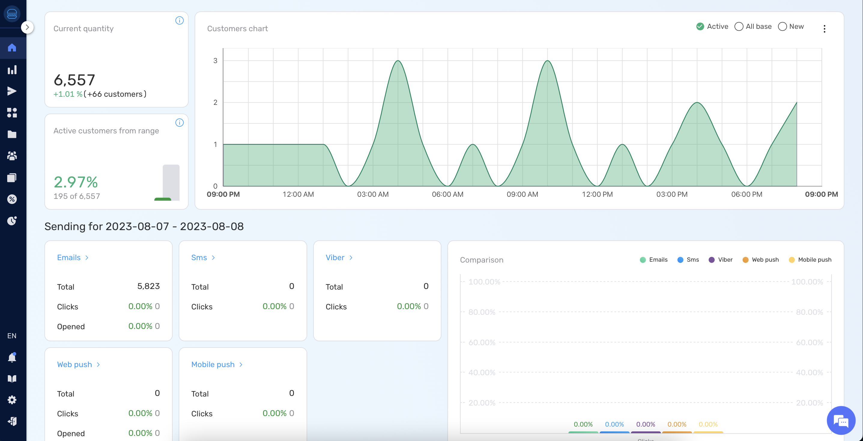
- Analytics Chart: A graphical representation that showcases the data for the selected period. This chart will display metrics for new customers, all customers, and active customers.
- Tip: If you wish to view data for a specific customer group only, click on the desired group in the chart legend to toggle its visibility.
Segment Analytics #
Segment Analytics provides a deeper dive into specific customer segments.
How to Display Segment Analytics: #
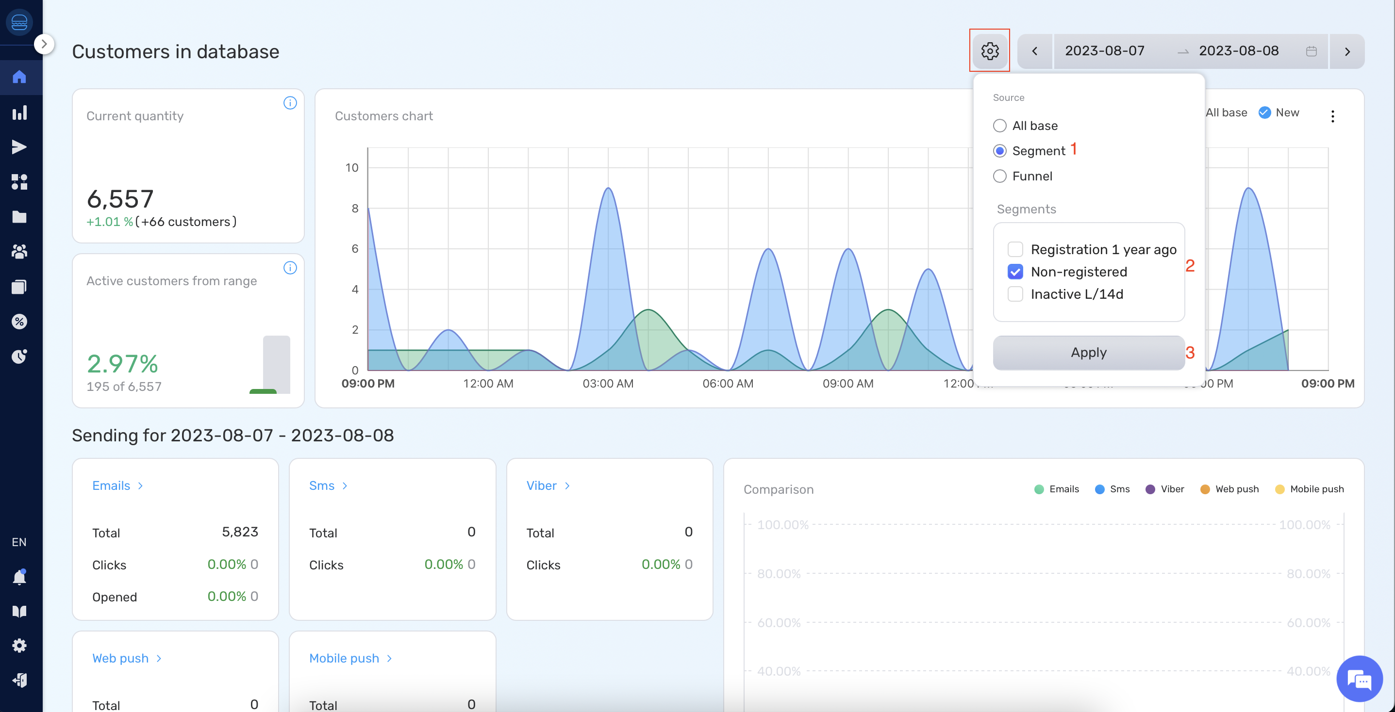
- Click on the “Settings” button.
- Under “Source”, choose “Segment”.
- Select the necessary segment(s).
- Click “Apply”.
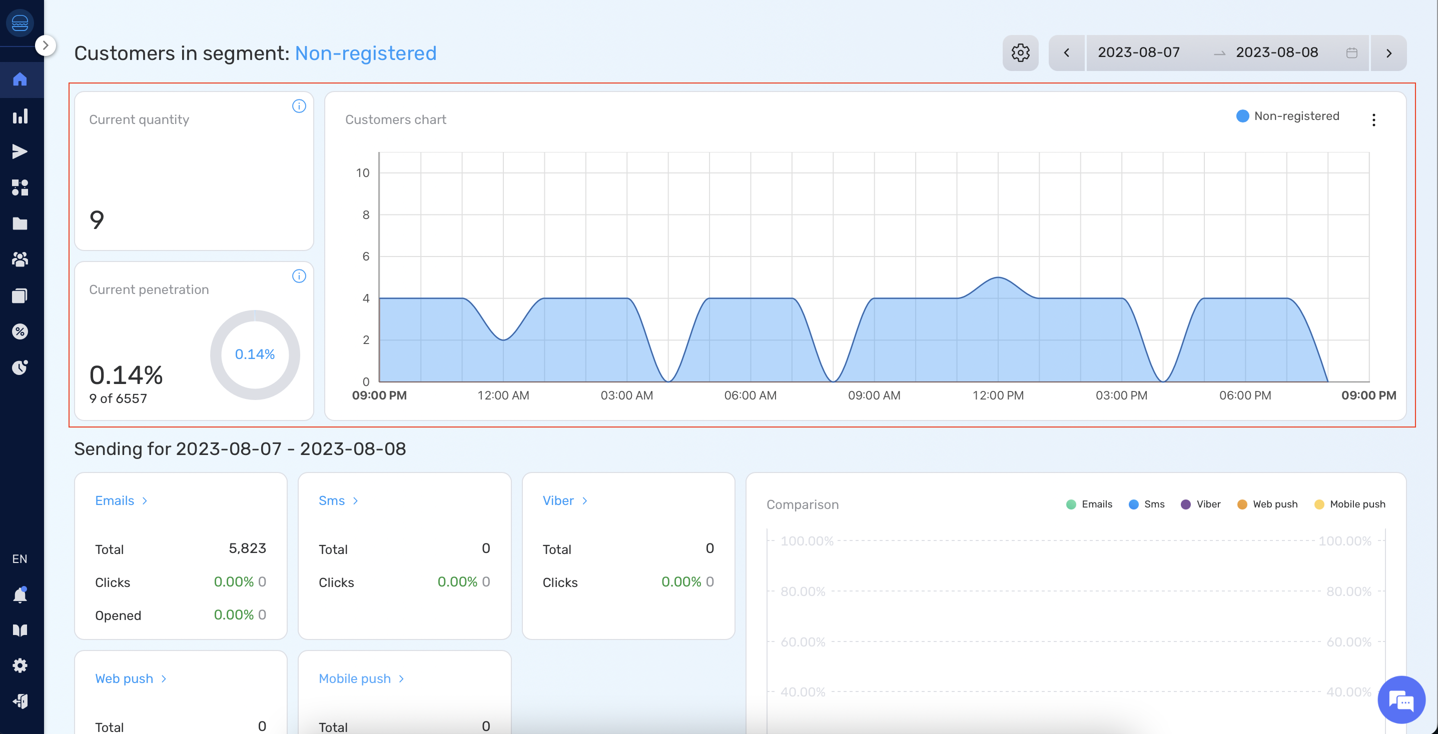
What you will see: #
- Segment Quantity: The number of customers in the segment
- Segment Penetration: A comparison of the chosen segment in relation to the entire database.
- Segment Chart: A visual representation showing the number of people in the segment for the selected period.
Funnel Analytics #
Funnel Analytics helps you understand how customers move through specific funnels.
How to Display Funnel Analytics: #
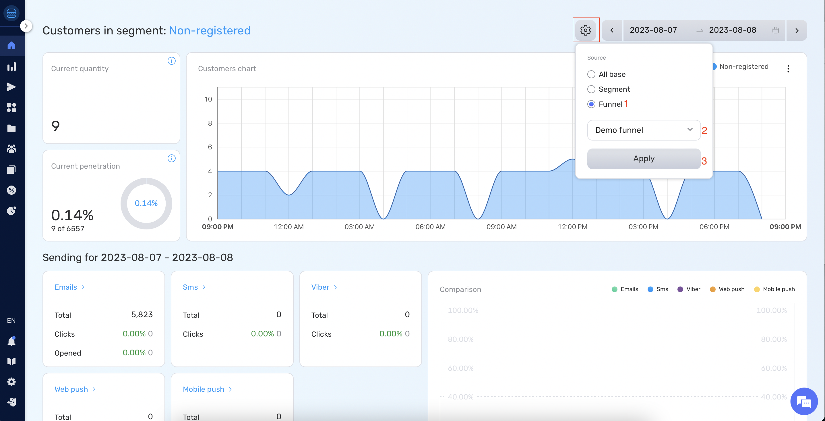
- Click on the “Settings” button.
- Under “Source”, choose “Funnel”.
- Select the required funnel.
- Click “Apply”.
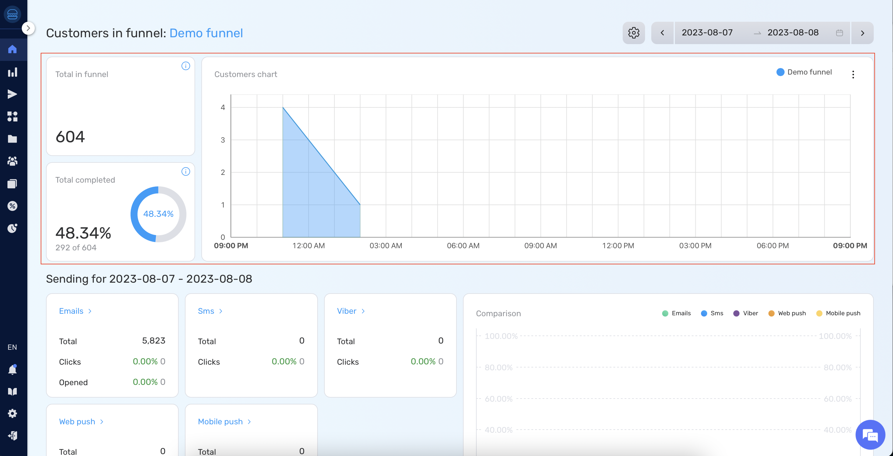
What you will see: #
- Entrants: The number of customers who entered the funnel.
- Completion Rate: The percentage of customers who successfully completed the funnel.
- Completion Chart: A visual representation detailing the number of customers that completed the funnel over the chosen period.
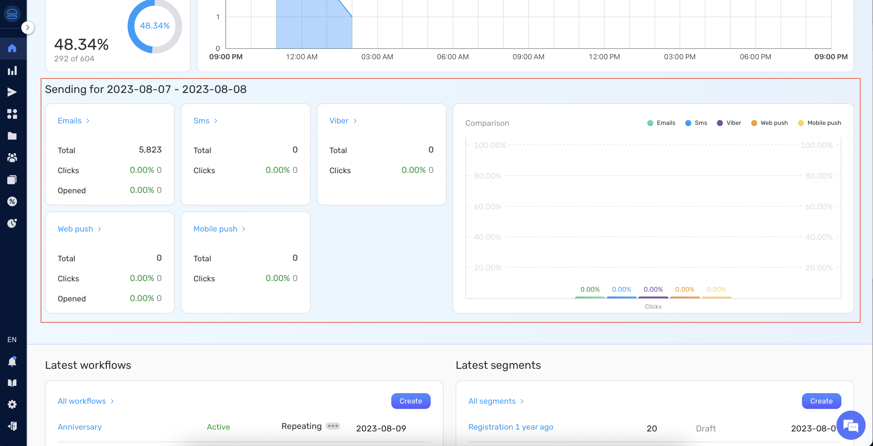
Sending Analytics #
Sending Analytics gives insights into the performance of your communication efforts.
What you will see: #
- Communication Details: For each communication channel, view metrics such as:
- Number of sent communications.
- Number of opened communications.
- Click-through rates for the communication.
- Comparison Chart: A bar chart that allows you to compare the performance of different communication channels, specifically focusing on which channel resulted in the most clicks.
This documentation provides a brief overview of the functionalities of the Retainly Dashboard. Always ensure you explore each section in detail to get the most out of the platform.


